BRAND
Powerful visual identities that captivate.
Emerald Peaks & Co.
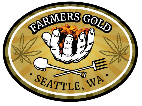
I’ve worked with my friend in Seattle for many years on his many brands in the Washington State cannabis market. For all his design needs from branding to packaging and more, I’ve been with him for almost every step of the way. It’s been quite fun to see it grow, even if having to jump through every new regulatory hurdle is not the most fun.
Fifth Class Designs
A friend of mine from school needed a logo for his CAD design and electronics teaching studio. I helped him out.

All treatments for Fifth Class Designs logo
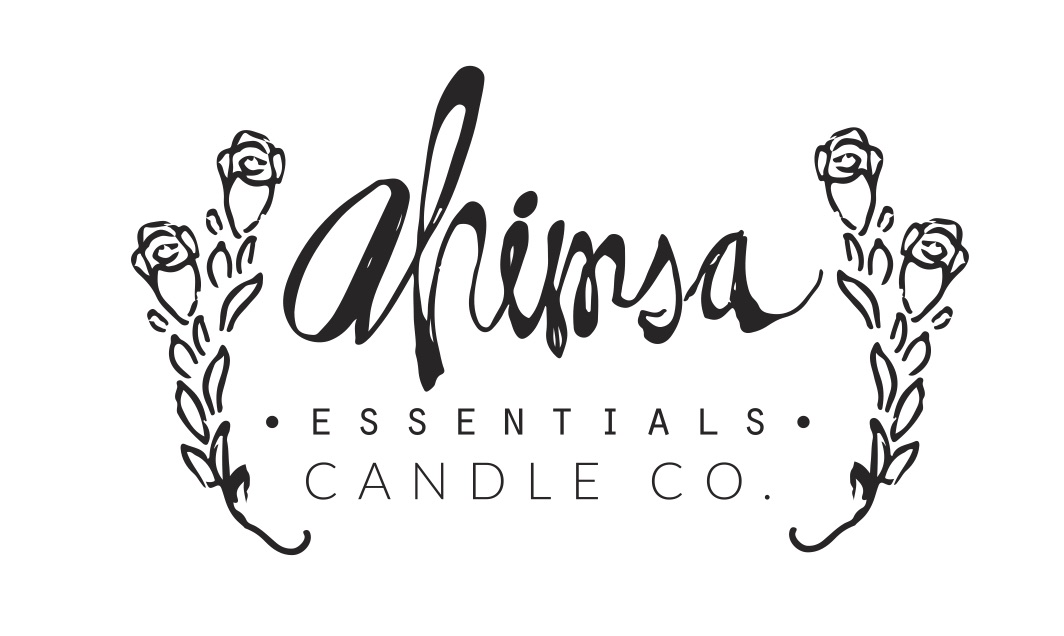
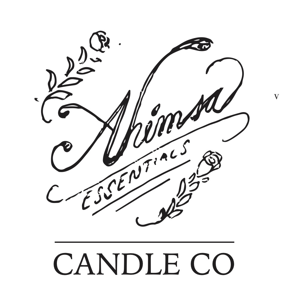
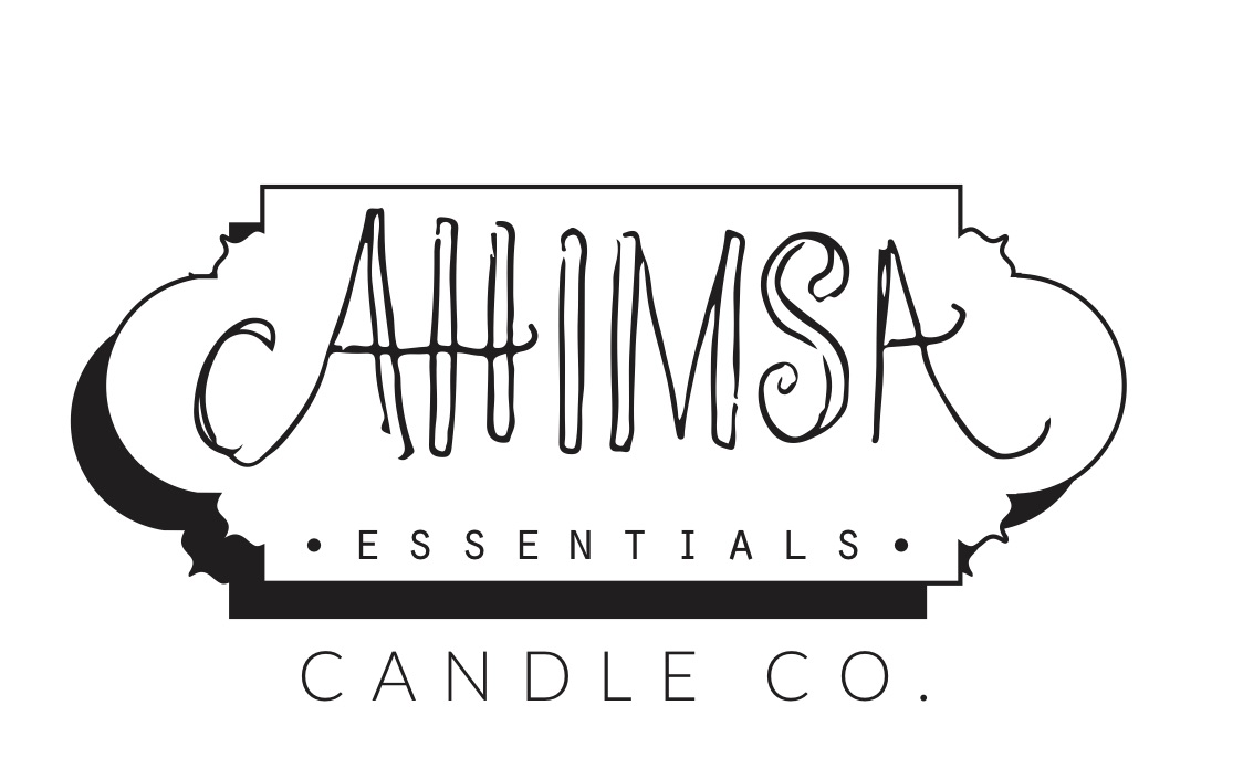
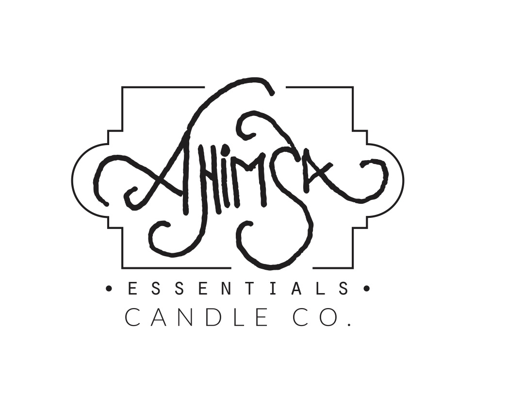
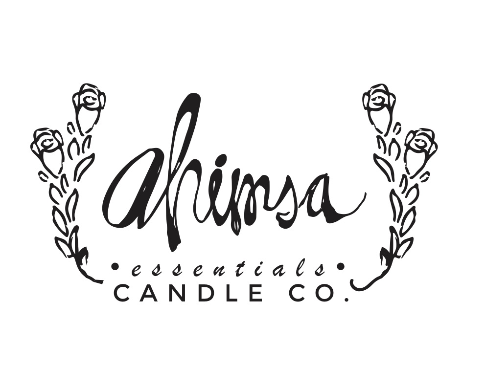
Ahimsa Essentials Candle Co

Logo for Ahimsa Essential Candle Co

Associated Labels
BOOK TRAILS
The first of two projects I had with a good friends' startup in Colorado. I worked to sketch this up and was at the time working with some freelancers to help me polish it up. We chose to literally represent it going out into the woods and into fantasy - as that is what the program was for - and still quite successfully is. I think it turned out great!


Reading on Ranches
Is the second of two projects I had with a good friends' startup in Colorado. She had a clear vision in mind, so it was simply my job to create it in line with the first logo we had already created - Booktrails. For this one we went with a little flatter aesthetic.
It was a great pleasure to work with such an awesome person, for such an awesome cause!
The final logo (without subtitles). The final text is a result of mimicking the type treatment for Booktrails, so there is more consistency from image to image, as they are sibling camps, organized together.
Final sketch of the background. From here, and the sketch above, I constructed these images in Adobe illustrator, and finally composed and polished the final piece in Adobe Photoshop.
Final sketch of kid on the horse.
Initial sketches of the logo elements. Once I know how I will compose the final piece, I work on each element individually and then reconstruct them - a good design trick that is a substantial time-saver.
Zone Trac
Is a tool that helps you "get in the zone" through audio/visual feedback mechanism. I was asked to prepare a logo design that emphasized the technical nature of the product, as well as the resultant whole-body effects of being able to master your mental state. I tried using the tool, it's awesome, though not so easy. Learn more here.
The final logo which emphasizes all the above notes from the client, as well as achieving a level of shine and pop.
I was asked to clearly depict a person receiving light stimulus through the retina, which then lit a rainbow through the brain, and then down to the heart, and finally from there to the body. He recognized this effort as 90% there, just needed a pose change - as shown above.
The client wanted a person in a standing tai-chi pose, this level of clarity can really help the process move along - my job then becomes an art of transcription rather than translation - a much easier task.
This was my first effort to depict all concepts in a simple, unique manner - after all the area we were working with is about 1" in diamter... maybe a little more. As you can tell the direction he wanted to go was entirely different, though he respected this effort as clean and professional.
Handlebar Media
This is my own marketing company that helps develop customize pathways to success. Through quality branding, and consistent committed communications we can help you get where you want to go.

The final design.... Ah what a pleasure when everything just comes together. We intended to mimic the simple stamp-like power and class of Ralph Lauren Polo... I think we made it in the ballpark... yes?

Working on the details of the piece, trying to finalize the engineering, the functionality - the verisimilitude.

Getting the solid background layout almost complete. As soon as the overall composition is near complete, finalizing internal highlights is a breeze.

Our final concept was a man riding a bike plane - nothing we'd created at that point was even close in sheer awesomeness, symbolism, or longevity.
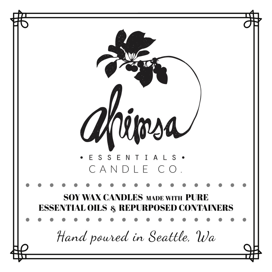
AHIMSA ESSENTIALS


This was a fun project, that I don’t think is still active. Well, at least I have this documentation, haha! I hand illustrated the text and found some good plant illustrations to incorporate into the design. I find converting hand drawn illustrations into logos has the nice effect of giving it a much more natural feel. The organic unpredictable eccentricities are picked up by our senses and tell us this is ‘real’ or ‘authentic’ in ways that rigid lines do not.
FLY FLAMINGO

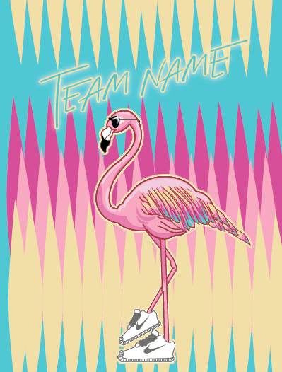
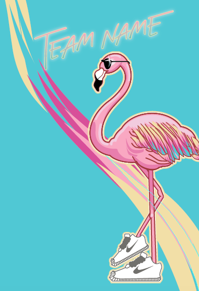
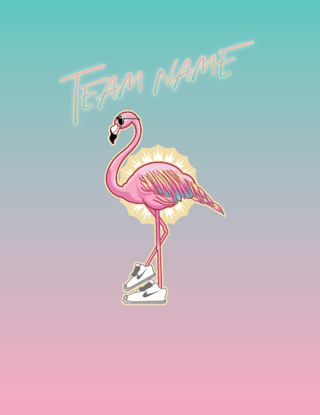
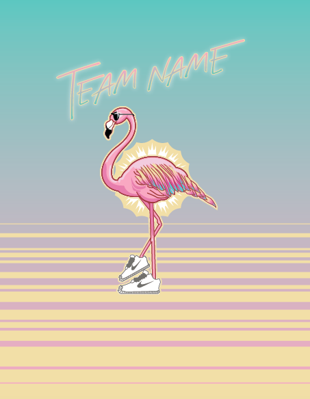
Did this flamingo piece for a friends ultimate frisbee team in Washington D.C., you may see someone bidding with it donned in the wild. Their inspiration is the mort artistic flamingo design as well as the pattern here at the bottom.


BITTERROOT ACCUPUNCTURE
My friend started an acupuncture therapy clinic in Missoula, MT, and asked me to design her logo. The Bitterroot river runs through the Missoula Valley and Missoula itself, as well as being a beautiful and therapeutic flower. Maayan wanted a deciption of the flower, and I was happy to deliver.


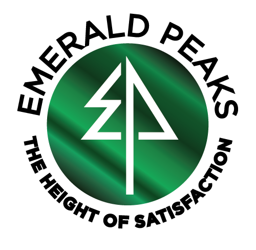
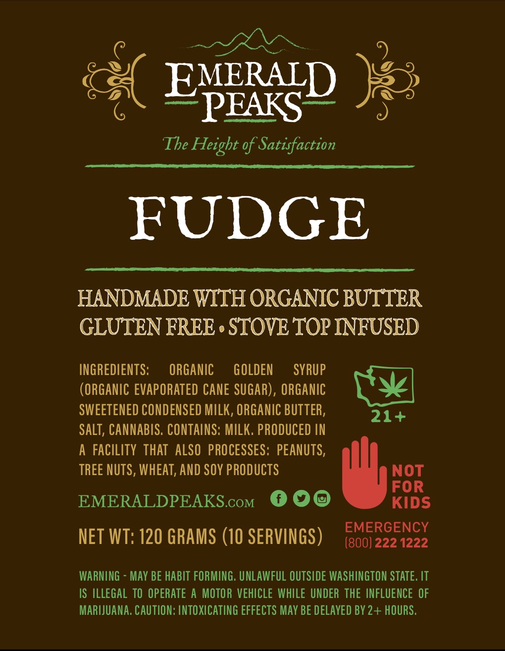
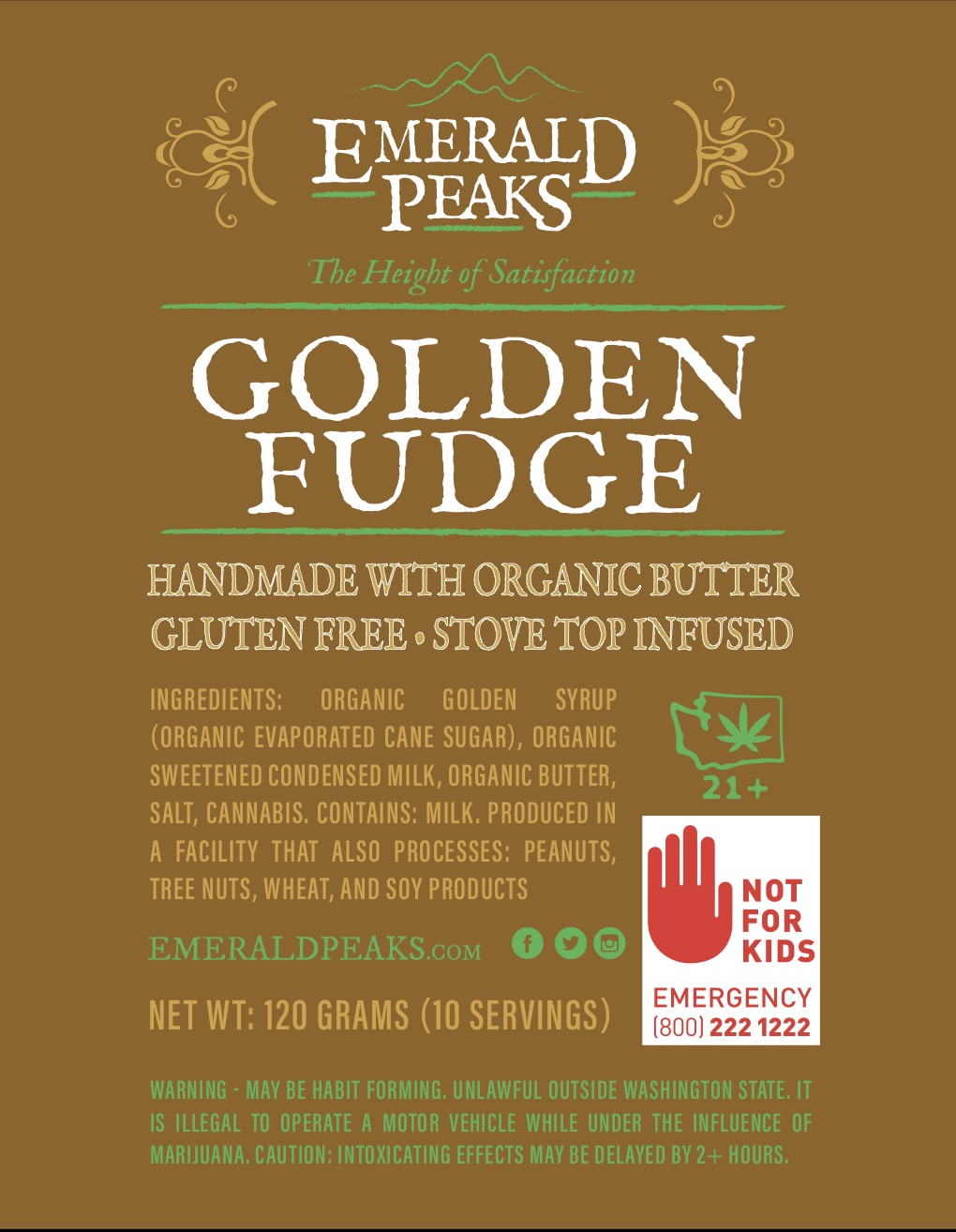
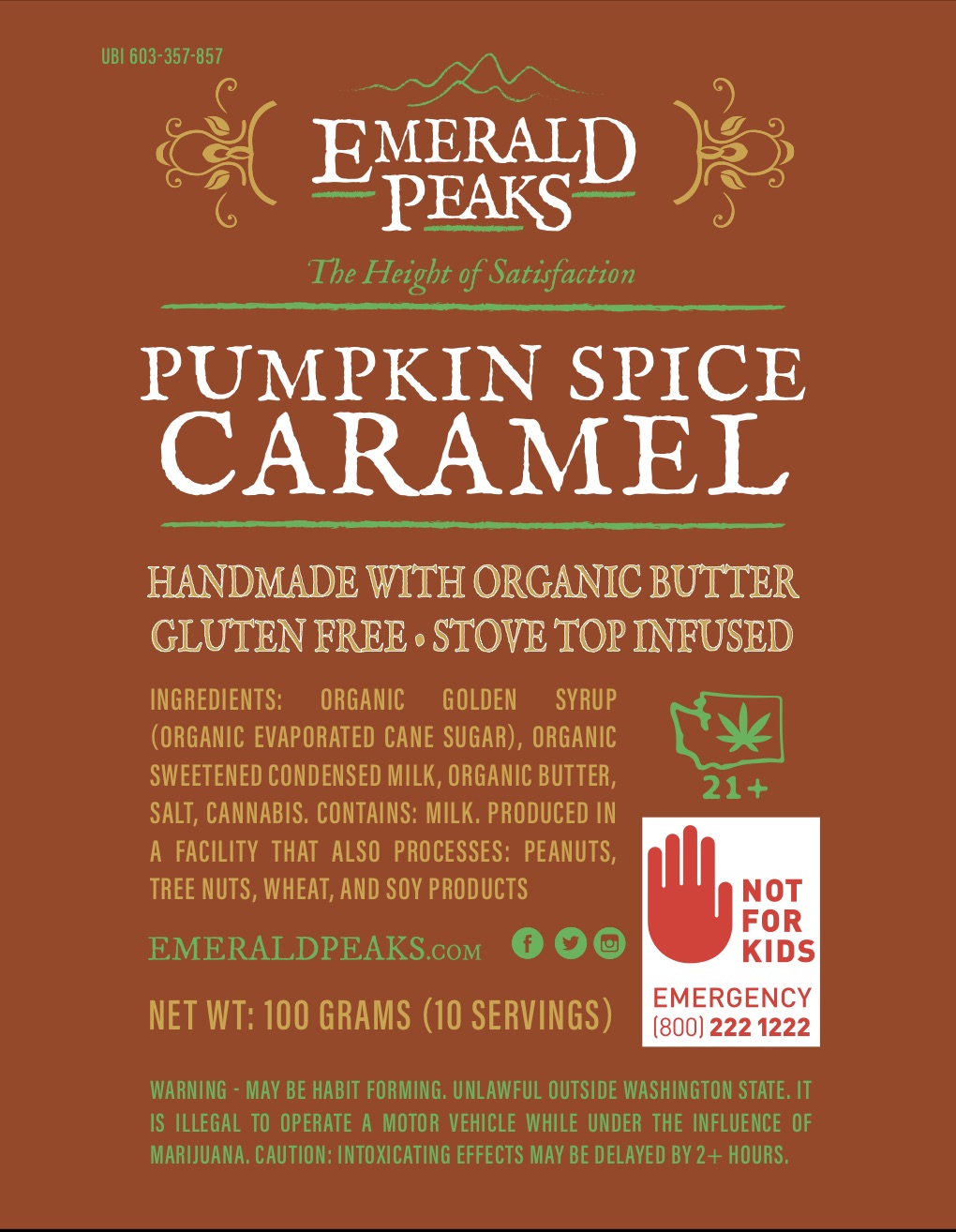
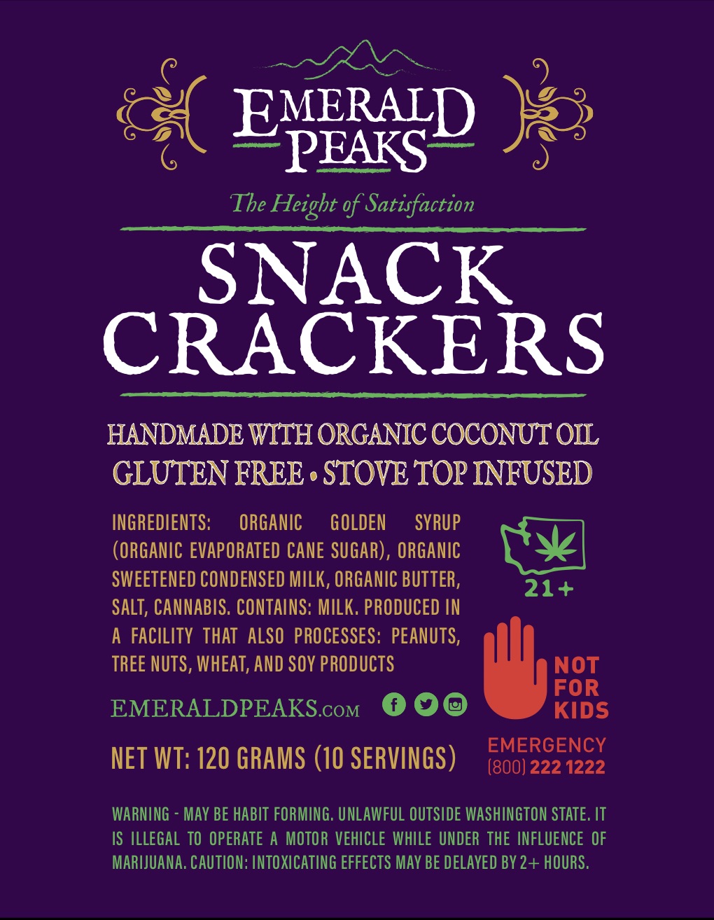
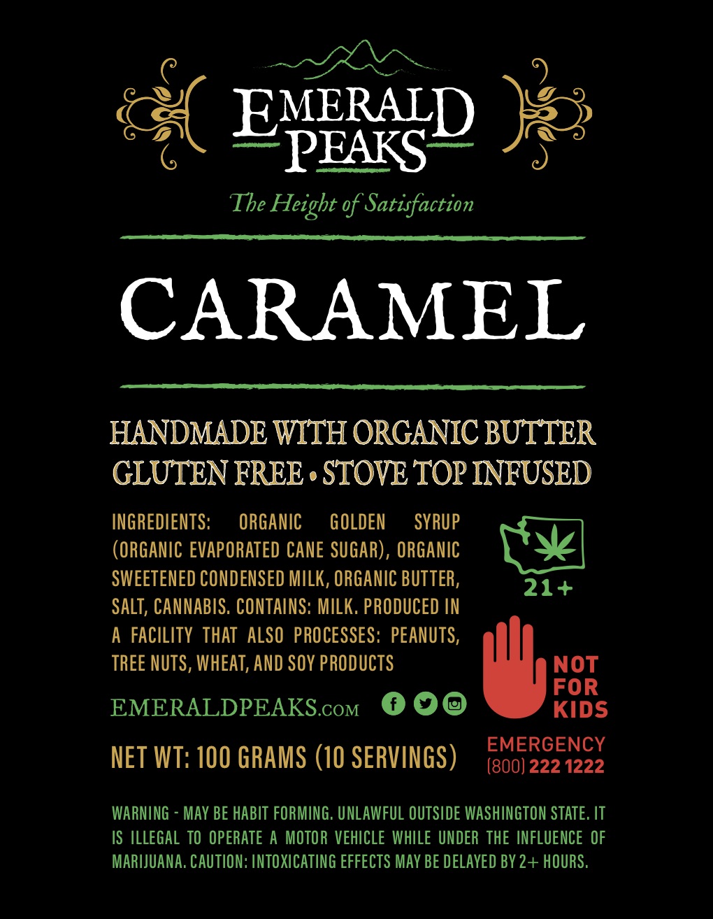
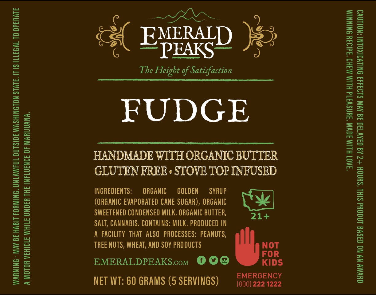
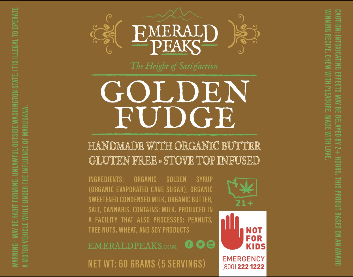
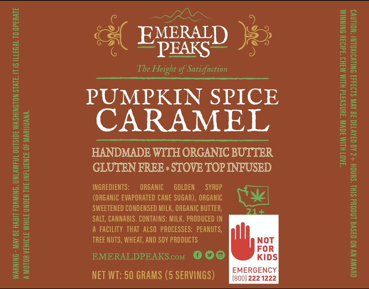
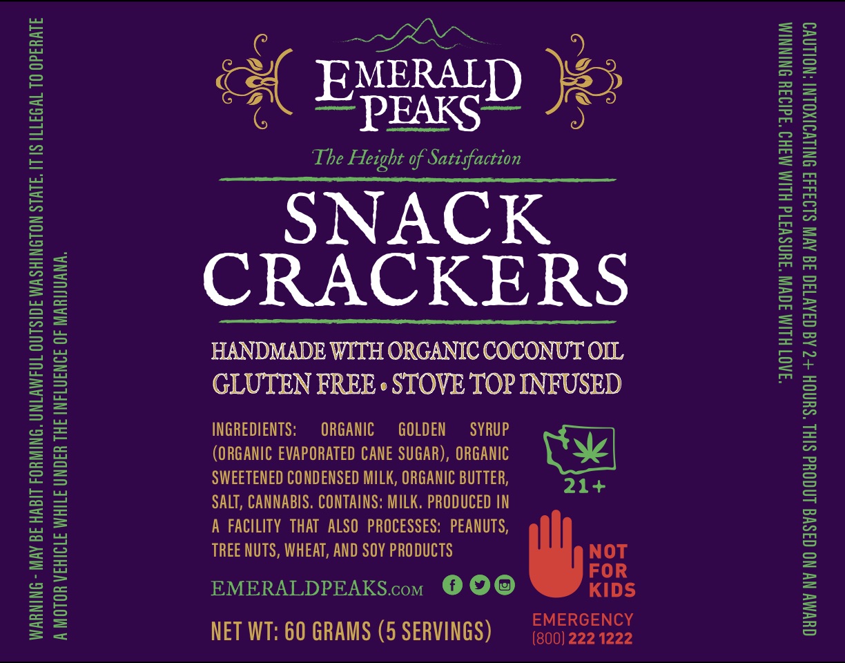
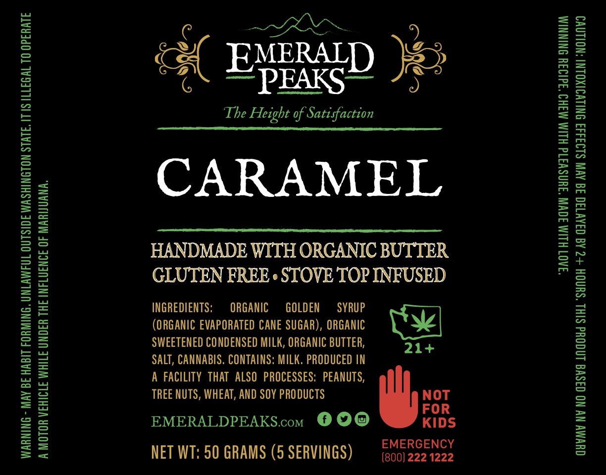
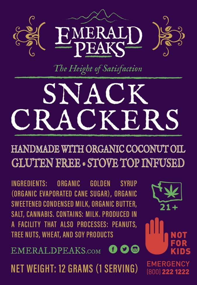
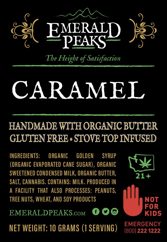
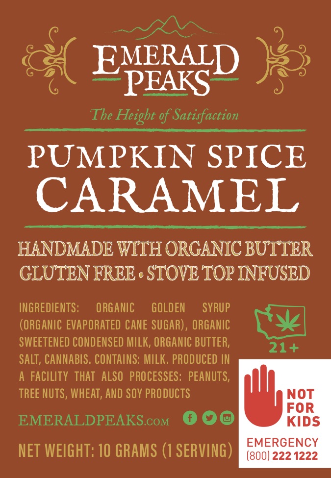
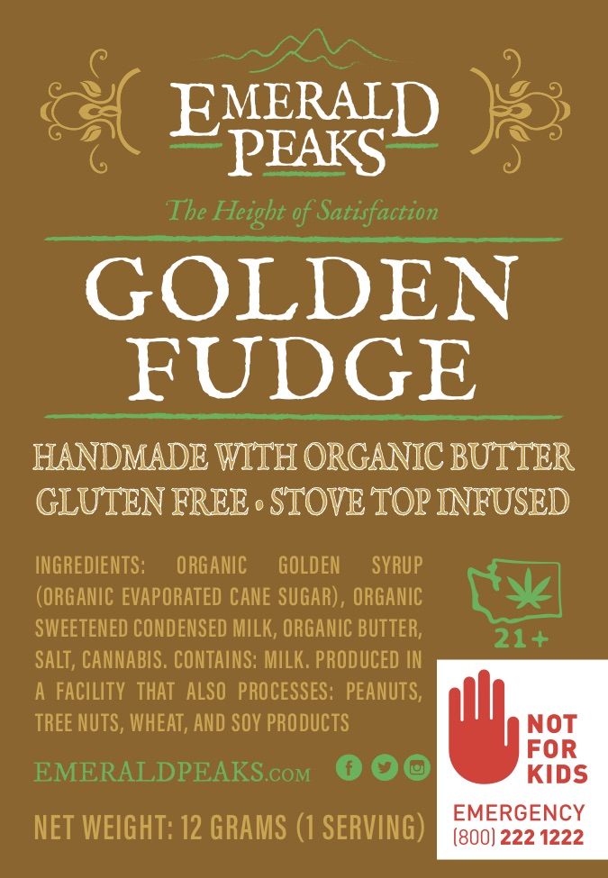
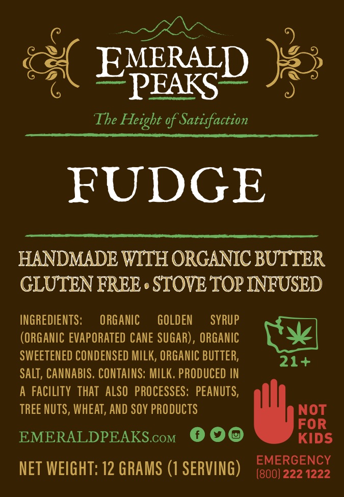
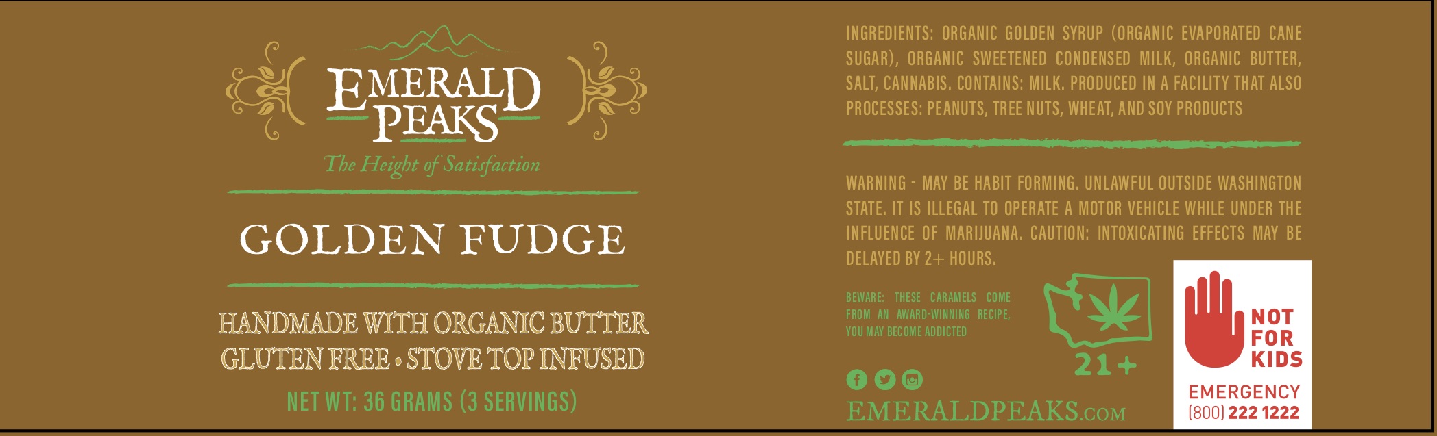
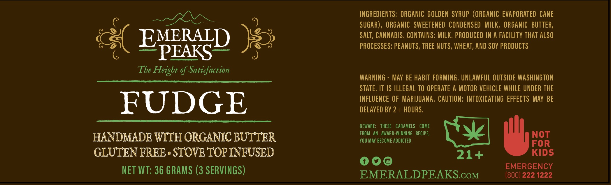
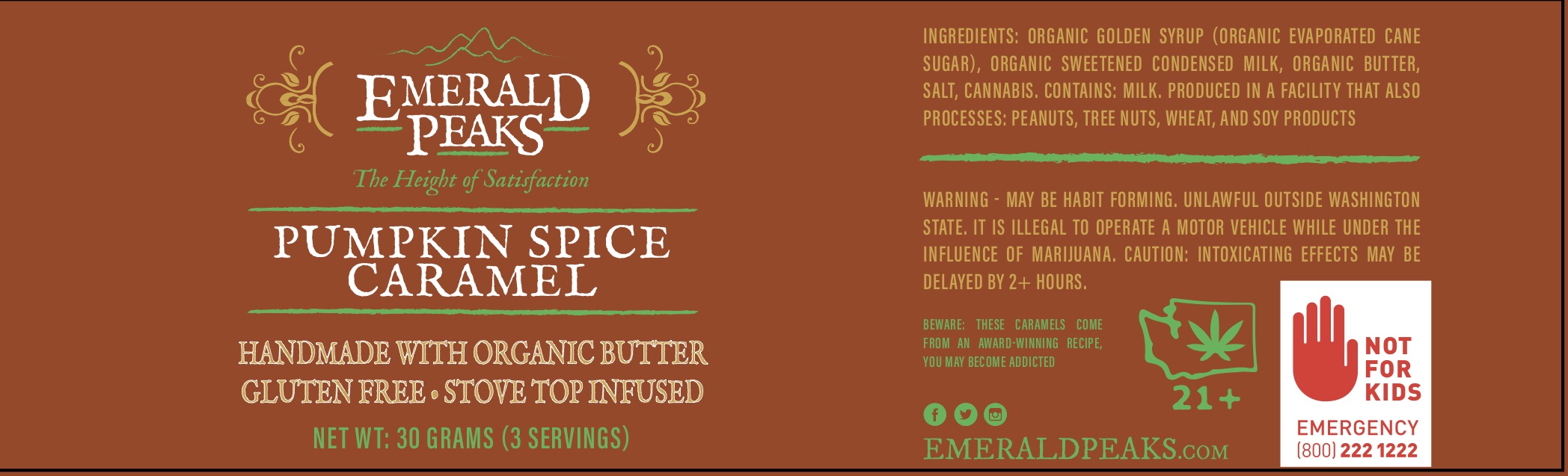
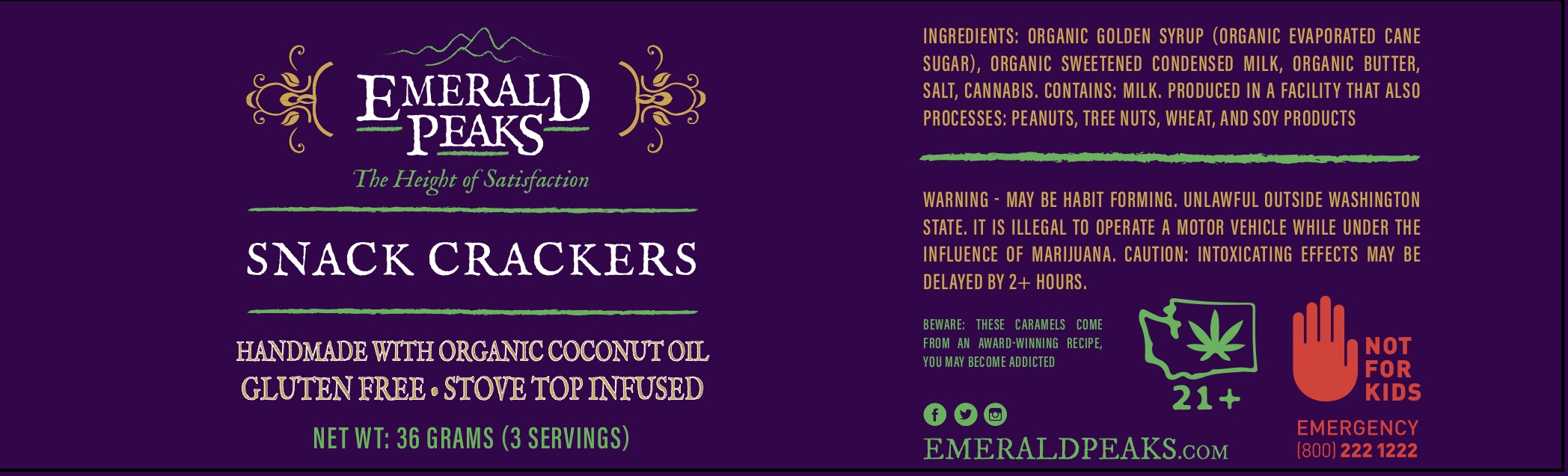
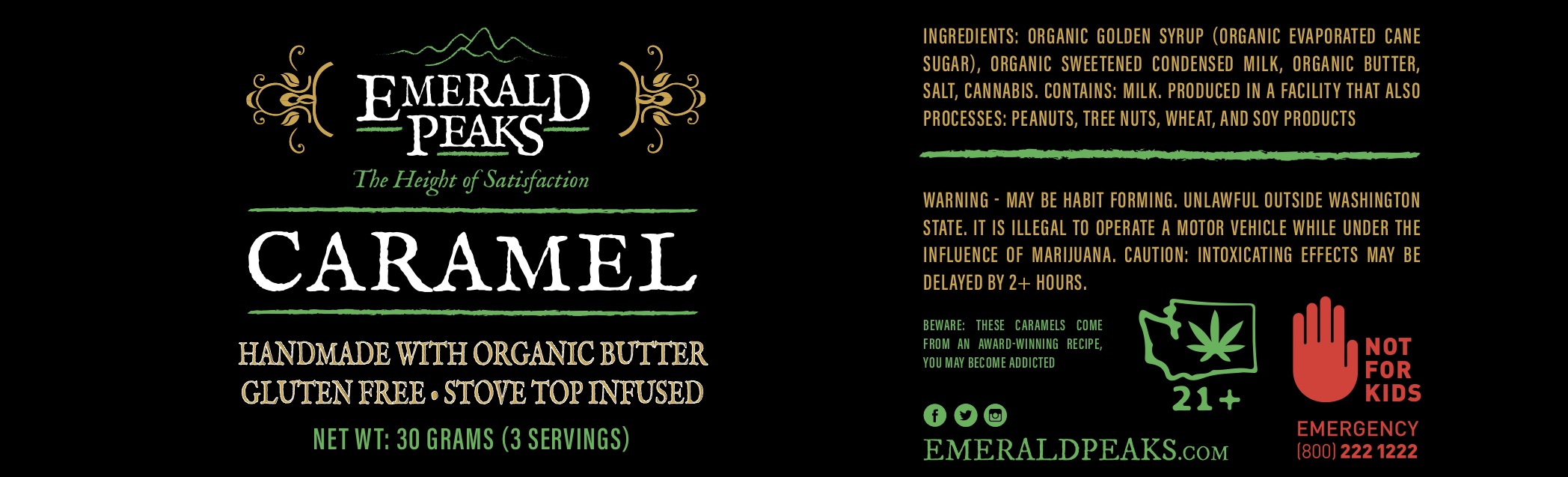
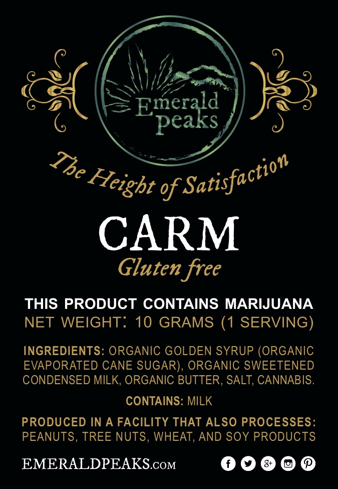
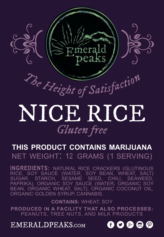
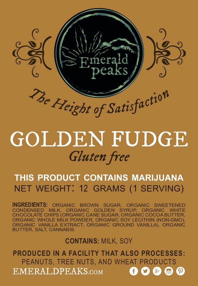
EMERALD PEAKS
This is a project I’ve worked on for quite some time. Emerald Peaks is a Tier-II Cannabis Producer/Processor in Washington State. I’ve developed the brand, through a few iterations, to its most recent brand view, shown in most of the examples below.


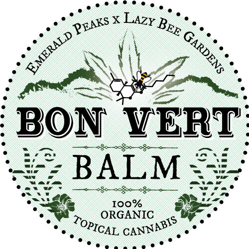
BON VERT BALM
This brand developed in tandem with the package design. The producer of the balm had some pretty clear ideas about their style and design direction, so it mostly my responsibility to connect these ideas to the existing brand - Emerald Peaks - that the product would be a child of. Lazy Bee Gardens Bee - the partner brand that would be the direct supplier of cannabis for this product - also had to be incorporated. I did these with some old-timey text and patterns that evoked a hand-made product made with care. Which it is. The response was immediately positive! Another project I’m happy with.


RAINIER ROSIN
The final stickers in all their glory, made a green and blue and all gold version, not sure which would be wanted more.
Step one: sketch it out in pencil (colored pencil better). Step two: go over it in semi-thin marker. Better than a ball point pen which doesn’t lay down ink over pencil as well.

Step two: scan or photograph, port into computer, and edit in photoshop. Here you can see the piece mid-process. I think I realized here that I didn’t really need the letters, and was instead just focusing on the mountain.
Add drops to the text in illustrator, convert to a single object and copy over to photoshop for the embossing.

The background with sunbeams in a draft moment